


 0
0From Awful to Awesome: How To Break The Taboos
April 9th, 2013 by Debbie
We’ve all been there – whether it’s fashion, interiors or the colour of your car – the ‘what was I thinking?!’ moment is inevitable. I’ve created a fool-proof interiors guide on how to step outside the box without losing sight of it…
Monochrome
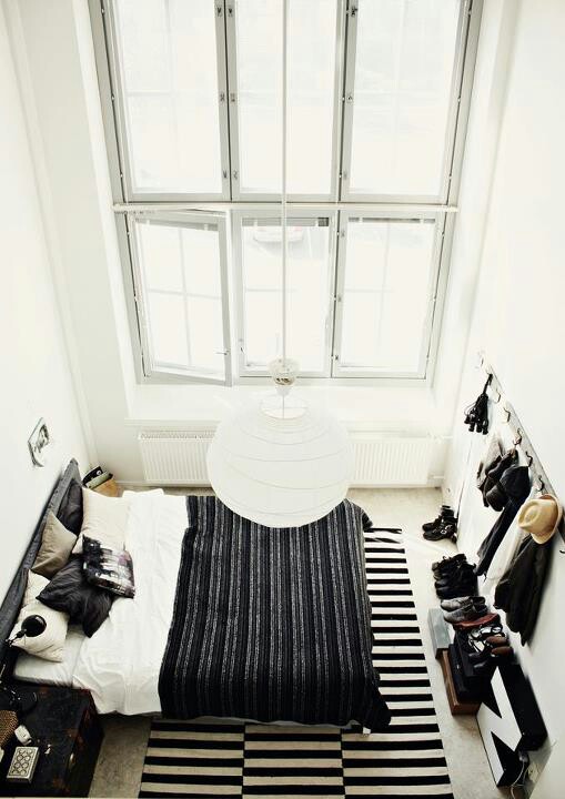
It is very easy to go OTT with the monochrome trend, but this is exactly how it should be done. The striped black and white rug sets off the subtly striped bedspread, and the mis-match of cushions adds a laid back vibe to the room, further emphasised by the hanging coats and hats.
Do! ↓
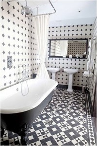
↑ Don’t!
This monochrome bathroom is way too busy. There’s nothing wrong with a bit of print clashing now and again, but the black and white tiles paired with the patterned walls are too much to take in. This look could have been nailed with plain white walls to draw the eye to the beautiful flooring.
Kitsch Kitchens
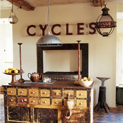
This is how kitsch is done. The worn look of the cabinets adds to the vintage feel, and the structured mirror and candle sticks show that kitsch doesn’t always have to be cute. The cool brown and beige colours give it a masculine feel while maintaining the classic, vintage vibe.
Do! ↓
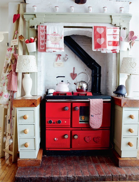
↑ Don’t!
This kitchen is so sweet it probably has diabetes, and that is never a good thing. Everything from the impeccably placed tea towels to the hearts splodged around the place looks contrived and dated. Who needs two kettles?
Neon Colour Blocking
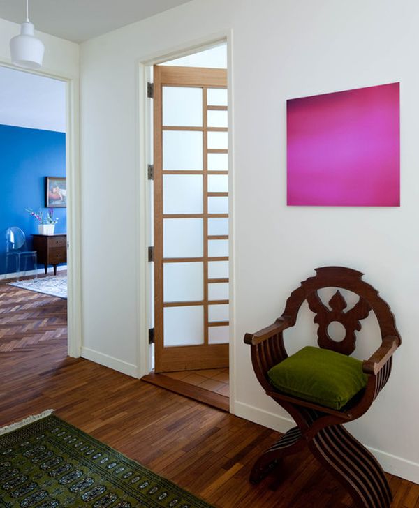
Neon colour blocking is a bold and intimidating trend. The easiest and most effective way of going about it is to keep is simple and not overdo it. This room shows a deep blue wall, which looks beautiful and eye-catching, and a neon pink canvas. This look is simple yet very effective – and you can cash in on the trend without painting your entire house neon pink…
Do! ↓
↑ Don’t!
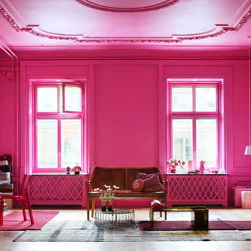
Oof. This is a bit much. The important thing with colour blocking is to make sure it’s balanced. A wall with pink details and matching pink cushions is clever accessorising – painting your radiators and window sills pink is colour blocking gone mad.
Animal Print
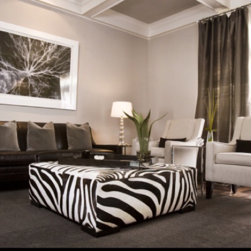
Using one large, eye-catching piece of furniture is an effective way of making the most out of animal print without having to change your entire layout. This look works best when using a statement piece of furniture in a room that is a neutral colour with simple, structured furniture.
Do! ↓
↑ Don’t!
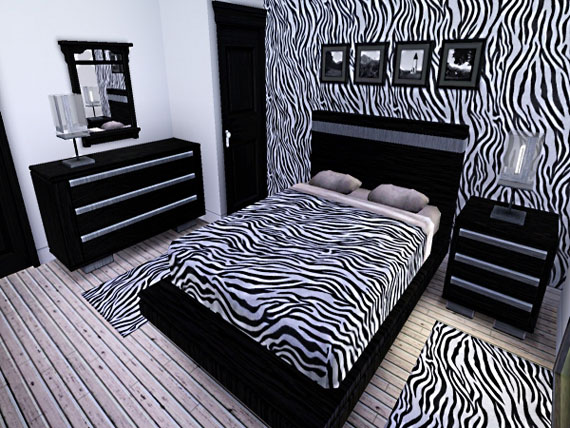
This image speaks for itself. Someone has clearly helped themselves to a herd of zebras here. Matching too many prints can look tacky and overdone, and having walls, floors and bedding covered in this print makes the room look too busy.
You may also like

On November 18th, 2022 Colin wrote on the subject of Company News and Press Releases.

Get the Look: Pantone Colour of the Year 2021
On January 22nd, 2021 Debbie wrote on the subject of Colour schemes, Industry News, Interiors and Ideas.
Forget Feature Walls, What About a Statement Ceiling?
On April 3rd, 2018 Debbie wrote on the subject of Fun Stuff, Interiors and Ideas.